This article is a homework response to the article
"Copy Rights" by Barbara Pollock. This response is a continuation of week four's homework assignment.
Sara Krajewski was correct when she said that appropriation has been made simple by downloading or scanning an item. Appropriation really is a hard topic to interpret because the word can have different meanings to different people. However, to be a true appropriation artist means to add a different concept and meaning to another artist's piece of work. It honestly takes more than just slapping an emoji over a hand and calling the art "appropriated". It takes actually thinking and having a new vision for a piece of work. Not every artist adheres to these "appropriation rules" but some of them do have outstanding pieces of art.
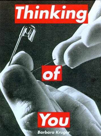
One artist in particular that I have come to really like is Barbara Kruger. Kruger takes photographs in pop culture and adds words to them that changes the meaning and context of the original photo. My favorite piece is
Thinking of You
because it adds a sense of discomfort to a heartening saying. The term 'Thinking of you' could be posed negatively when looking at the picture because maybe you're thinking about a past lover or ex-boyfriend that hurt you and thinking of them is like pricking your finger on a needle.
The difference between 'appropriation' and 'sampling' is that appropriation is reworking someone's original idea into your own original idea and building off of it to create something new. Sampling is just a gentler way of saying appropriation and seems more "acceptable". Image transfer is more of a way to take more than one different work of art and creating a new piece from them.
In a way, I kind of agree with Lichtenstein's idea about 'reappropriation' because videos and films are a sort of appropriation of what really happened in real life (such as movies 'Based on a true story'). However, I disagree with her because not everything is technically appropriated, because the filmmakers have prior permission to create the works and do actually consult with the original artist about their work.
Lastly, I will talk about some of the works from Elaine Sturtevant. She was an American artist who is known greatly for her appropriation and conceptual art pieces. A NY Times article describes her pieces as artfully and tastefully appropriated and comments on her flawless repetition artwork. A famous piece of Sturtevant's was a reworking of Roy Lichtenstein's
Crying Girl. Although I can't find a good picture that shows the differences between Sturtevant's and Lichtenstein's, I still like how Sturtevant was able to rework other's art into her own and create tasteful appropriation pieces without causing trouble with the original artists.